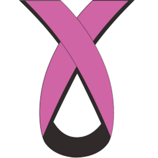
Breast Cancer Action’s Logo
Our symbol is a registered trademark since 2001, which stands alone among all other breast cancer ribbons. The ribbon is always worn with the loop down.
– Raise awareness
– The teardrop shape represents the tears shed at diagnosis
– The Rose colour salutes the courage of the thousands diagnosed
– The Black lining is in memory of the thousands who have died
– The challenge is to end the deaths so that we can remove the black and wear the rose in celebration.
Here is an excerpt from Musa Mayer’s book: “Advanced Breast Cancer-A Guide to Living with Metastatic Disease”, Chapter 1: Denial, Fear and Popular Perceptions:
“The universal symbol of breast cancer awareness in recent years has been the pink ribbon, appropriated from the ubiquitous AIDS red ribbon. Breast cancer activists frequently object to this symbol. “This is not a pastel-coloured disease, and little strips of cloth will not end the epidemic,“ wrote Barbara Brenner, Executive Director of Breast Cancer Action of San Francisco. “Of all the pink ribbon pins made over the last several years, only one manages to convey the dual reality that breast cancer patients really face, and it is that of the Ottawa-based Breast Cancer Action group, that uses an upside-down pink ribbon, in the shape of a teardrop, the pink lined with black.”